
3D Graphics
ZBrush’s Notoriously Weird UI Is Finally Getting Fixed
For the First Time in 20 Years, ZBrush is Overhauling Its UI
At ZBrush Summit 2025, Maxon unveiled the first teaser of a completely redesigned UI for the desktop version. Months have passed since that initial reveal, and the production release still hasn’t shipped—the launch timeline remains undetermined. But what makes this announcement compelling isn’t simply that “the UI looks prettier.”
ZBrush’s interface has long been described in the industry as “legendarily idiosyncratic”—a phrase CG Channel itself has used, but which has also become common shorthand within the community. Now, that interface is finally getting a complete overhaul for the first time.
This article isn’t just a feature announcement. It examines why ZBrush needs a UI redesign now, and explores the direction this transformation is taking.
Why ZBrush’s UI Earned Its Notorious Reputation
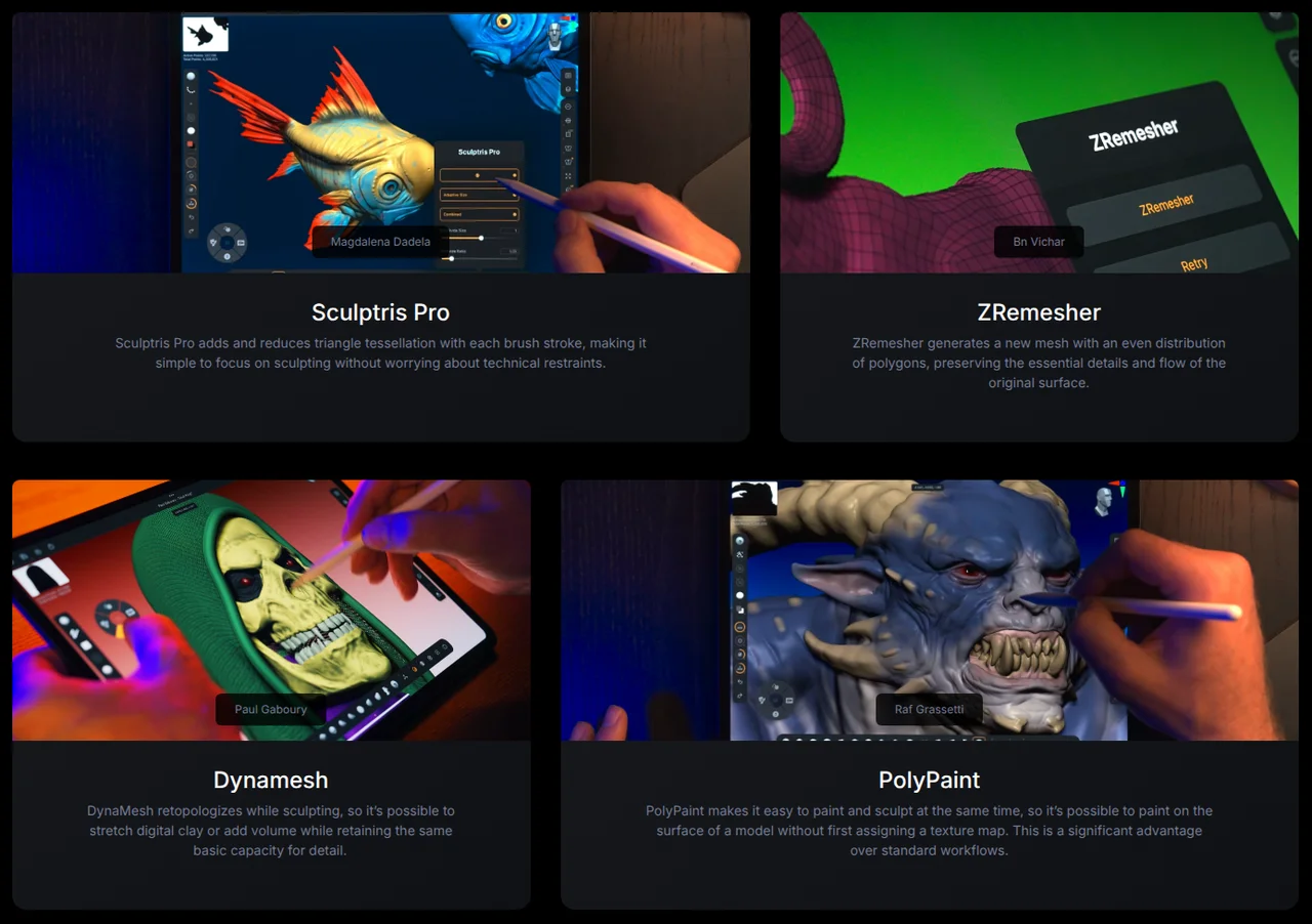
ZBrush’s learning curve doesn’t stem from feature complexity. When someone trained on Maya, Blender, or 3ds Max first opens ZBrush, the shock comes from the fundamentally different interaction paradigm. Viewport navigation, menu structure, and tool access share almost no common language with other DCC applications.
As a result, learning ZBrush has traditionally been treated within the community almost as a rite of passage. Once you adapt, many aspects actually feel intuitive, and seasoned users often say “other tools feel clunky after you get used to ZBrush.” However, the time investment and frustration required to reach that comfort level has been a genuine barrier that’s driven away countless new users.
Maxon doesn’t deny this reality. In announcing the UI overhaul, they explicitly acknowledged that the steep learning curve of the existing interface was a primary motivation for change. Redesigning an interface that’s been essentially unchanged for nearly two decades isn’t optional—it’s overdue.
Why ZBrush Needs This Redesign Now—The 3D Printing Influx
ZBrush started as a specialized tool for film and game studios. The UI philosophy assumed experts would invest time in adaptation. Studio artists could absorb a few months of onboarding as part of the job. Under that model, the existing UI worked fine.
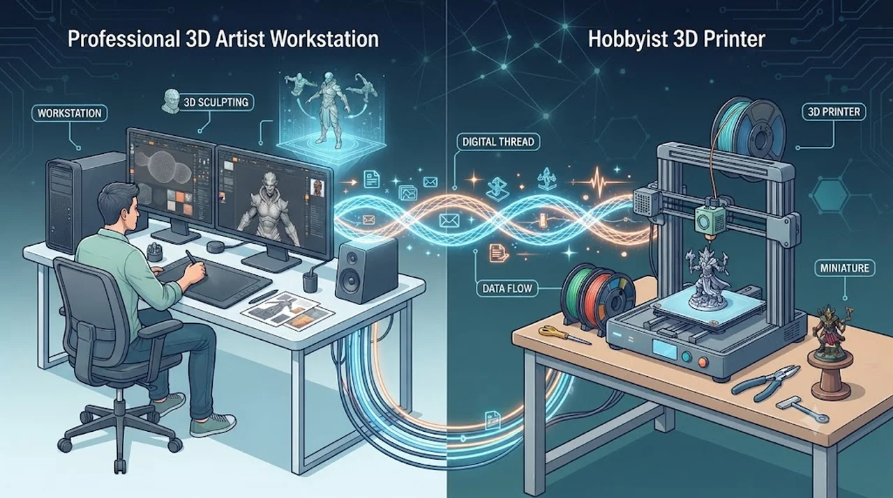
But over the past few years, 3D printing exploded into the mainstream, and the user demographic flowing into ZBrush shifted dramatically. Hobbyists wanting to sculpt figures, miniatures, and collectibles for 3D printing discover ZBrush in this process. The fact that ZBrush already includes built-in features like 3D Print Hub signals that Maxon has been tracking this audience.
For this new user base, a 20-year-old non-standard interface becomes a different kind of barrier. Professional artists have motivation to invest learning time; hobbyists are far more likely to quit before reaching proficiency. For ZBrush to evolve from a “studio-exclusive tool” to “the sculpting tool for the 3D printing era,” UI simplification isn’t a nice-to-have—it’s a prerequisite.
| Category | Existing Professional Users | New 3D Printing Hobbyists |
|---|---|---|
| Primary Use Case | Film, game, and commercial projects | Personal figure, miniature, and collectible production |
| UI Adaptation Capacity | Can invest learning time as part of their job | Sensitive to onboarding friction—it’s a hobby, not work |
| Expected Experience | Fine-grained customization depth | Intuitive learning curve and speed |
| ZBrush Entry Point | Desktop professional workflows | 3D Print Hub and sculpting features |
Note: This user segmentation reflects the author’s market analysis and is not based on official Maxon figures or classifications.
Where the New UI Came From—iPad Philosophy Ported to Desktop
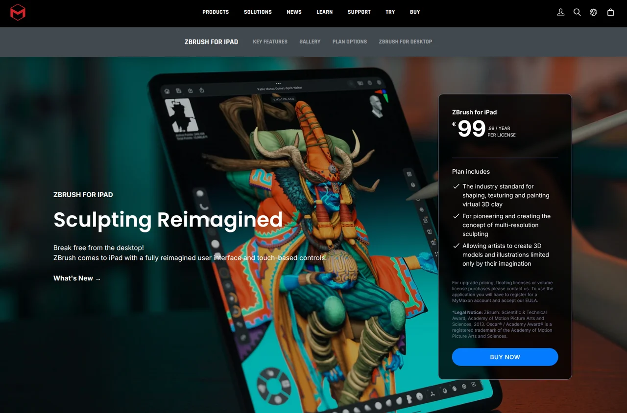
The most significant aspect of this redesign is that Maxon didn’t architect a new interface from scratch. Instead, they’re bringing proven principles from ZBrush for iPad directly to the desktop. The iPad version was inherently touch-based, so it was forced to adopt an intuitive, streamlined interaction model from day one. The constraints of a small screen, no mouse, and limited space for expanding palettes actually produced the elegant UI.
The three core improvements shown at ZBrush Summit 2025 break down as follows. First: Mode Switching. You can now toggle between core brush types with a single control instead of hunting through palettes. Second: Contextual Interface. Only tools relevant to your current task appear on screen. Third: Customizable Layout. You can detach menus, reposition them, or float them over the viewport as needed.
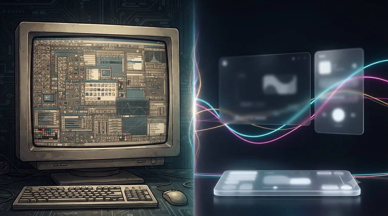
All three stem from a single principle: show only what you need, hide everything else. Where the old UI exposed all available tools at all times, the new UI dynamically surfaces tools based on your workflow context. On desktop this is optional; on iPad, it was essential to survival.
| Aspect | Legacy UI | New UI (iPad-Derived Philosophy) |
|---|---|---|
| Tool Switching | Manual palette exploration | Single-toggle mode switching |
| Screen Layout | Fixed palette arrangement | Free placement with hide/show options |
| Tool Exposure | All tools visible at all times | Context-aware tool visibility |
| Design Origin | Desktop-first professional design | Validated first on iPad, ported to desktop |
Maxon’s Real Endgame—Desktop and iPad UI Convergence
Maxon’s stated goal is to make the desktop and iPad interfaces “identical or minimally similar.” To achieve this, ZBrush for iPad will receive updates alongside the desktop overhaul. The two platforms’ UIs are converging.
When complete, gestures and workflows learned on iPad transfer directly to desktop. Cross-platform friction vanishes. Adding interpretation: this positions iPad as the entry-level onboarding environment, naturally funneling users to the desktop version when more complex work demands it. Learn the basics on the accessible platform, build muscle memory, then graduate to the professional environment with zero relearning.
Of course, this works only if the two UIs achieve genuine operational parity. The real test is how substantially similar the day-to-day interaction feels across both. Since launch hasn’t happened yet, hands-on validation will come post-release.
What About Existing Users—Legacy UI Support Plan
Maxon has committed to maintaining the legacy interface—at least initially. Users aren’t forced to switch; you can choose between the new and existing UI. Your years of keyboard shortcuts, palette muscle memory, and workflow habits don’t evaporate overnight.
For professional users, there’s minimal immediate concern. Continue with your current setup, and when the new UI proves faster and more efficient, migrate at your own pace. No forced migration means you control the conversion cost.
One important caveat: Maxon’s language is “at least initially.” Nothing in any official statement guarantees permanent legacy UI support. How long legacy UI remains supported remains unclear based on what’s been announced so far. Following official Maxon communications after launch will be essential.
When Will It Ship—ZBrush 2027.0 Outlook and Current Status
At ZBrush Summit 2025, Maxon didn’t commit to a specific release version or timeline. What they’ve shared so far amounts to “we’re developing a new UI, and here’s the direction we’re heading.” Until an official announcement, the launch date remains fluid.
Industry publication CG Channel, basing their analysis on Maxon’s historical release cycles, estimates ZBrush 2027.0—roughly fall 2027—as the likely launch window. However, this is CG Channel’s projection, not an official confirmation from Maxon. Take the “fall 2027” estimate as directional guidance rather than confirmed fact.
As of this writing in July 2026, several months have passed since ZBrush Summit 2025, yet no production release has shipped. The detailed UI layouts and menu structure haven’t been disclosed either. Currently, the three design changes shown in the teaser—mode switching, contextual interface, and free layout—represent the full extent of officially confirmed updates.
FAQ
Q. When will the new ZBrush UI officially ship?
No official release version or date has been confirmed yet. CG Channel has projected ZBrush 2027.0 (around fall 2027) based on Maxon’s release history, but that’s an estimate only. For the most accurate information, check Maxon’s official channels directly.
Q. Can I keep using my existing shortcuts and palette layouts?
Maxon stated they’ll maintain the legacy UI, at least initially. Users can switch between the new and legacy interfaces. That said, there’s no guarantee of permanent support, and long-term plans should be clarified once the production release arrives.
Q. How does this redesign specifically benefit 3D printing artists?
The contextual interface shows only the tools relevant to your current task, hiding everything else. This reduces the need to hunt through the full palette, making it easier for hobbyists unfamiliar with CG pipelines to focus on sculpting itself. That said, real-world usability will only be clear after the official launch.
Counter-Argument Review — “Isn’t this redesign unnecessary for existing users?”
That counter-argument only holds for people who’ve already adapted. For those still in the adjustment phase—newcomers just picking up ZBrush—reassurance like “it’ll feel natural once you’re used to it” doesn’t help.
The gap widens for hobbyists and non-professionals. From Maxon’s perspective, the untapped user base represents far more growth potential than users already accustomed to the current interface. The counter-argument isn’t wrong; it’s just viewing the market from a different angle.
Treating ZBrush’s UI redesign as merely “a visual refresh” misses the weight of this announcement. It’s closer to a directional statement about who Maxon sees as ZBrush’s next audience.
3D printing adoption has pushed demand for sculpting tools beyond professional studios into broader markets, and ZBrush faces a window where it must expand its positioning. ZBrush for iPad was the first experiment; this desktop UI overhaul confirms that experiment worked and represents the next phase—applying the validated simplification philosophy to the core product.
If you’re considering ZBrush for the first time, the realistic approach is to wait until the official release and try it yourself before committing. CG Channel’s estimate points to fall 2027, though again, that’s a projection. Check Maxon’s official channels for confirmed dates.
※ This article is based on content from ZBrush Summit 2025, CG Channel reporting (November 2025), and Maxon’s official materials. Release timelines, legacy UI support policies, and feature details are subject to change—consult official documentation for the latest. The 3D printing user adoption analysis represents the author’s interpretation and is not an official Maxon statement.